
 by
by
A user lands on an iGaming platform for the first time. Within seconds, something has already happened — not a conscious decision, but a feeling. Either the page feels clear, calm, and navigable, or it feels loud, pressured, and slightly confusing. That feeling is not accidental. It is the direct result of design choices made by a product team, and in a category involving real money and real risk, those choices carry weight far beyond what most UX work demands.
UX ethics matter in every product category, but the stakes shift considerably when the subject is gambling. Unlike a retail site nudging you toward a slightly overpriced jacket, an iGaming platform can steer users toward financial decisions with genuine consequences. The user may be a casual player, or they may be someone vulnerable to compulsive behavior. The design cannot always tell the difference — but it can either protect or exploit that uncertainty.
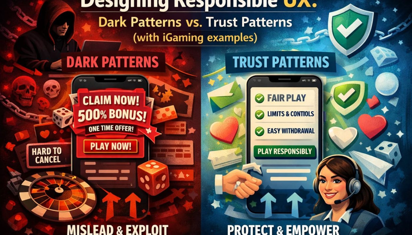
The core contrast at the heart of this piece is simple: dark patterns push users toward outcomes that serve the business at the user’s expense. Trust patterns do the opposite — they clarify choices, make consequences visible, and put the user genuinely in control. Both can appear on the same page. The difference often comes down to a single button label, a hidden checkbox, or a countdown timer that was never necessary.
This article examines both patterns in practical terms, using iGaming as a case study for what responsible UX looks like when the design environment is genuinely high-risk. The goal is not to provide a manipulation handbook — it is to help product teams, designers, and reviewers recognize the difference between design that builds trust and design that quietly erodes it.
What Dark Patterns Are
The term “dark patterns” was coined by UX designer Harry Brignull in 2010 and has since been taken up by regulators, researchers, and consumer advocacy groups worldwide. The FTC has published formal guidance on deceptive design, treating certain dark patterns not as aggressive-but-legal marketing but as potentially unlawful deception. That distinction matters.

Dark patterns are not simply bold calls to action or enthusiastic copy. They are design choices that deliberately obscure, confuse, or pressure users into actions they might not otherwise take. The manipulation is often structural — buried in the interface logic rather than written explicitly in the text. A pre-ticked checkbox for marketing emails is a dark pattern. So is a “Close Account” option buried five menus deep when “Deposit” is one tap from the home screen.
In practice, dark patterns work through several mechanisms: creating artificial urgency, hiding important information in visual noise, making the desired action easy while the alternative is frustratingly difficult, or presenting consent in ways that technically satisfy a legal requirement while functionally bypassing it. Each mechanism is a design decision. And each one can be reversed.
What Trust Patterns Are
Trust patterns are the deliberate, ethical counterpart to dark patterns. Where dark patterns obscure, trust patterns clarify. Where dark patterns create pressure, trust patterns offer calm and control. The goal is not to remove persuasion from design — persuasion is legitimate and present in every good interface — but to ensure users are making informed choices with full visibility of consequences.
Trust patterns share a few consistent qualities: plain language, visible options, easily reversible actions, and genuine transparency about what happens next. They reduce the anxiety that comes from feeling trapped or unclear, and that reduction in anxiety is itself a conversion tool — a user who trusts the interface is more likely to complete a journey, and more likely to return.
Signs of trust-first UX:
- Limits and controls are surfaced during onboarding, not buried in settings
- Bonus terms are summarized in plain language before acceptance
- Account closure or self-exclusion is as easy to access as a deposit
- Confirmation screens clearly describe what the user is agreeing to
- Error messages explain what went wrong and how to fix it
- Withdrawal timelines are stated upfront, not discovered post-request
- Support is visible on key pages, not only in the footer
- Cookie and consent banners offer a genuine “decline” option
- Privacy settings are editable at any time, not locked post-signup
- Session reminders appear without making users feel surveilled or judged
Why iGaming Raises the Stakes
Most digital categories involve some level of persuasion. An ecommerce checkout nudges toward a purchase. A streaming service makes cancellation slightly inconvenient. These patterns are worth criticizing — and regulators are increasingly doing so — but the consequences of a manipulated decision in those contexts are usually recoverable. You return a jacket. You cancel a subscription.
In iGaming, the consequences of manipulated decisions compound. A user nudged past a deposit limit, or confused about how to activate self-exclusion, or pressured by a false scarcity message during a loss streak, faces a materially different risk profile. The urgency is real, the money is real, and for a segment of the user population, the vulnerability is real.
Regulators have noticed. The UK Gambling Commission has issued specific guidance on responsible gambling tools being genuinely accessible — not technically present but practically invisible. The gap between a responsible gambling button in the footer and one surfaced at meaningful moments in the user journey is not a minor design detail. It is the difference between compliance on paper and compliance in practice.
Dark Patterns to Avoid
These patterns appear across real platforms in varying degrees of intensity. The business case for avoiding them is as real as the ethical one: users who feel misled complain publicly, churn faster, and rarely return. The short-term conversion gains from a dark pattern rarely survive an accounting that includes churn, complaints, and regulatory scrutiny.
| Dark Pattern | What it does to the user | Why it harms trust | Better alternative |
|---|---|---|---|
| Fake countdown timers | Creates artificial urgency | Users feel pressured, not informed | Remove timers; show real offer end dates |
| Pre-selected bonus opt-ins | Enrols users without active consent | Confusion when terms apply unexpectedly | Require explicit selection with terms visible |
| Buried self-exclusion | Makes limits hard to find | Signals the product discourages self-regulation | Surface limits in account nav and deposit flows |
| Hidden withdrawal fees | Discovered only post-request | Feels deceptive; damages long-term trust | State fees clearly on the withdrawal page |
| Roach motel account closure | Easy to open, very hard to close | Breeds resentment and support costs | Match closure flow complexity to signup |
| Pressure copy on loss streaks | Encourages continued play after losses | Exploits emotional state | Use neutral, factual language at all times |
| Ambiguous bonus terms | Users accept without understanding | Creates disputes and chargebacks | Summarize key terms in 3–4 bullets before CTA |
Trust Patterns That Still Convert
There is a persistent misconception in product teams that ethical design means passive design — that removing pressure removes conversion. The evidence does not support this. Users convert more reliably when they feel confident, and confidence is built through clarity, not urgency. Responsible onboarding that includes a visible deposit limit prompt does not reduce first-time deposits. It reduces the subset of deposits made by users who will immediately regret them — and those users generate chargebacks, support costs, and reputational damage.
The math often favors trust. A user who completes signup understanding the platform’s terms, knowing where to find limits, and confident about withdrawal timelines is a lower-risk and higher-lifetime-value customer than one who was rushed through an opaque funnel.
Trust patterns that help users move forward with confidence:
- Welcome flow includes an optional deposit limit before first deposit is made
- Bonus summaries are three to four lines, not a link to a separate page
- Withdrawal page shows current processing time and any pending verifications
- Identity verification steps are explained in sequence, not presented all at once
- Session length is visible in the interface, not hidden in a menu
- Responsible gambling tools appear in the main account menu
- Account notifications are opt-in with clear explanations of each type
- Support contact is accessible from every key decision screen
- “Cancel” and “Go back” are always present on multi-step flows
- Account history shows deposits and withdrawals with equal visual weight
Why Microcopy Matters
A button that says “Claim Your Bonus” and one that says “Continue to Account” create different mental states in the user. The first implies a reward is waiting and hesitation is foolish. The second is neutral and informational. Neither is inherently wrong — but the choice of which to use, in which context, with what surrounding design, is a live UX ethics decision.
Microcopy is where dark patterns often hide most effectively because it is easy to overlook in design reviews. A warning that reads “Please play responsibly” technically says the right thing. A warning that reads “If you’re finding it hard to stop, these tools can help” — and links directly to them — does something meaningfully different. Compare these pairs:
“Are you sure you want to leave?” vs. “Your session has been saved. Ready to continue later?”
“Unlock your full balance” vs. “Complete verification to access withdrawals”
The left column creates mild anxiety. The right column gives users information. That gap is the entire argument for responsible microcopy — and it costs nothing to fix.
Consent, Privacy, and Choice
“Consent theater” — a banner that technically offers choice but makes one option obvious and the other invisible — is increasingly recognized by regulators as falling short of genuine consent. The GDPR and similar frameworks increasingly require that consent be as easy to withdraw as it is to give. Most iGaming platforms are not there yet.
| UX Moment | Dark Version | Trust Version | Why It Matters |
|---|---|---|---|
| Cookie banner | “Accept All” prominent; “Manage” in grey fine print | Equal visual weight for accept and decline | Real consent requires real options |
| Marketing opt-in | Pre-checked during signup | Unchecked by default with clear explanation | Opt-in must be active, not bypassed |
| Push notifications | Enabled by default, multiple steps to disable | Single toggle per notification type | Users should control their own attention |
| Email preferences | “Unsubscribe” buried in footer of emails | Preference centre linked in account settings | Accessible control builds long-term trust |
| Privacy settings | Visible once during signup, then locked | Editable at any time from account menu | Circumstances change; settings should too |
Withdrawal, Verification, and Friction
KYC (Know Your Customer) verification is one of the most friction-heavy moments in any iGaming journey, and one of the most trust-critical. Users who hit unexpected verification walls during a withdrawal request — after depositing freely — experience a sharp drop in platform trust, regardless of whether the compliance requirement is legitimate.
Responsible UX here means sequencing verification prompts intelligently, explaining each step in plain language, and setting accurate time expectations. Resources like Gambling Therapy provide useful context on how friction and confusion during sensitive moments can affect vulnerable users in ways that go well beyond ordinary UX frustration.
A user who understands why they are being asked for a document, how long it will take, and what happens next is in a materially better position than one who receives a generic error message and a support ticket number. The compliance requirement is identical. The UX is not.
Why Trust Patterns Help Business
Retention is cheaper than acquisition. This is not a new insight, but it applies with particular force in iGaming, where customer acquisition costs are high and brand differentiation is difficult. A user who trusts a platform recommends it, returns to it, and creates fewer support issues along the way.
Trust is also harder to rebuild than to maintain. A single experience of a hidden fee, a confusing exit flow, or a self-exclusion request that took unexpectedly long can permanently end a user relationship. The short-term conversion gains from a dark pattern rarely survive an accounting that includes churn, complaints, and regulatory scrutiny. In practical UX audits, reviewers sometimes compare live operator journeys — including platforms such as https://uptowncasino.net — to assess how clearly key actions, terms, and safety tools are presented.
Platforms that design genuine responsible gambling tools into their core flows — not bolted on as a footer afterthought — face fewer enforcement actions and are better positioned as regulation continues to tighten. The ethical approach and the commercially sensible one are increasingly the same approach.
A Practical Review Checklist
When reviewing an iGaming UX flow for responsible design, these are the questions worth asking out loud in the room — not as a compliance checklist, but as a genuine design audit:
- Is account closure or self-exclusion reachable in fewer than three steps from any main screen?
- Are deposit limits presented during the signup or first-deposit flow, not only in settings?
- Do bonus terms appear in plain language summary before the user accepts?
- Are countdown timers tied to real deadlines, or are they decorative urgency?
- Does the withdrawal page state processing times and any outstanding verification steps?
- Are consent options given equal visual prominence — not just technically present?
- Does support appear on key decision screens, not only in the footer?
- Is KYC verification explained as a sequence, not dumped as a single wall?
- Do error messages explain what happened and how to resolve it?
- Is session time visible without requiring a menu navigation?
- Does the responsible gambling section contain real tools — limits, cooling-off, self-exclusion?
- Has the mobile flow been reviewed separately, not assumed to mirror desktop?
Common Mistakes
Even teams with good intentions make design choices that quietly undermine trust. The most common ones follow a consistent pattern: ethical intent exists at the policy level but doesn’t survive the detailed design phase. The values are in the strategy deck. They just don’t make it to the button label.
A few patterns appear repeatedly:
- Responsible gambling messaging added as a last-minute compliance checkbox
- Bold “safe” or “transparent” language in marketing while the actual flow contradicts it
- Over-designed bonus screens that visually distract users from reading terms
- Mobile flows with tiny tap targets on limit or exit controls
- Support hidden behind a chatbot that cannot escalate to a human
- Session reminders set so infrequently they have no practical effect
- Ethical messaging present only in the footer, invisible during actual decisions
- Bonus clarity hidden so far below the fold that most users never reach it
| Area | Warning Sign | Safer Improvement |
|---|---|---|
| Responsible gambling tools | Listed in footer only | Surfaced in account menu and deposit flow |
| Bonus terms | Accessible via a separate external link | Summarized inline, before the CTA |
| Mobile UX | Not reviewed separately from desktop | Tested specifically for tap target size and flow |
| Consent design | “Accept” visually dominant over alternatives | Balanced visual hierarchy across all options |
| Verification flow | Single generic error for all KYC issues | Step-specific guidance with expected timelines |
The gap between a platform that says it cares about users and one that designs like it does is measurable. Users feel it. Regulators increasingly measure it.
Dark patterns tend to produce short-term results — a slightly higher deposit rate, a slightly lower unsubscribe click, a few extra seconds of session time. What they also produce, invisibly, is attrition, complaint volume, and eroded trust that is very difficult to trace back to a specific design decision but very real in its effects.
In iGaming specifically, responsible UX is not an optional layer added over a working product. It is structural. The decisions made in onboarding, consent, verification, session design, and exit flows are the product, as much as the games themselves. Treating those decisions as secondary to conversion optimization is a category error that shows up eventually in the data.
Good design in this space means designing for the person who needs the exit as clearly as for the person who wants to deposit — and that standard is both the ethical and the commercially sensible one.